HEMA
opdrachten in dienst van studio kluif
HEMA is een internationale retailer met winkels in Nederland, België, Duitsland en Luxemburg. De HEMA dankt haar populariteit onder andere aan de sterke aandacht voor design. Sinds 2002 heb ik meegewerkt aan tientallen productlijnen en honderden verpakkingen voor o.a. food, baby en kids verpakkingen.
HEMA is an international retailer with shops in the Netherlands, Belgium, Germany, Luxemburg and France. HEMA owes its popularity among other things to its focus on design. I have contributed contributed to dozens of production lines since 2002 and hundreds of packings for food, baby and children's articles.
HEMA is an international retailer with shops in the Netherlands, Belgium, Germany, Luxemburg and France. HEMA owes its popularity among other things to its focus on design. I have contributed contributed to dozens of production lines since 2002 and hundreds of packings for food, baby and children's articles.
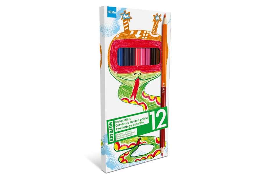
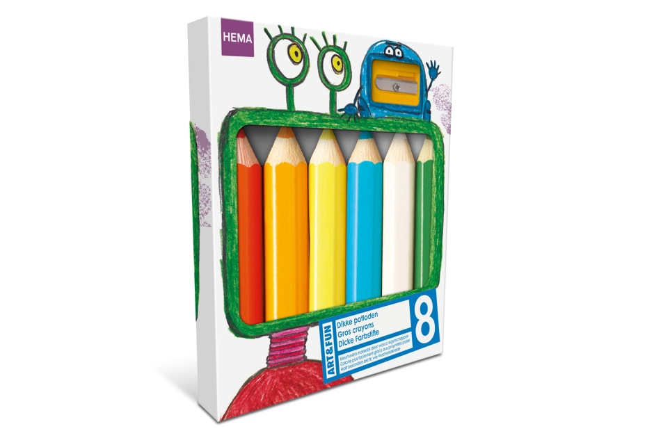
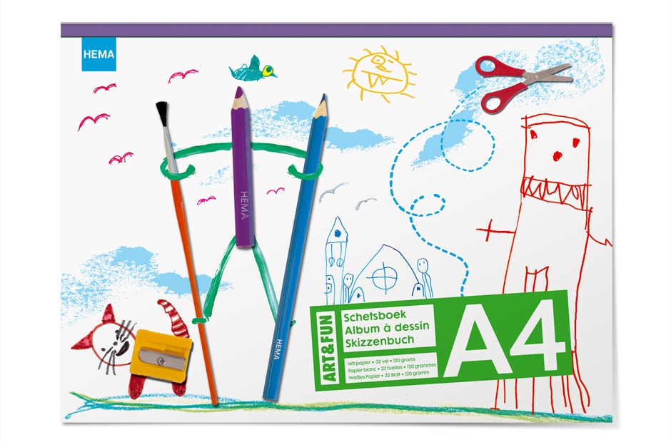
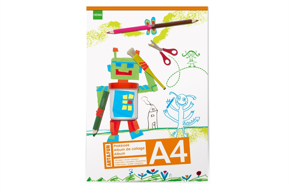
VILTSTIFTEN EN KLEURPOTLODEN Nominatie ADCN prijs 2011
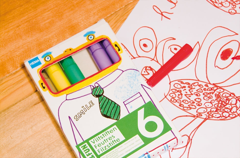
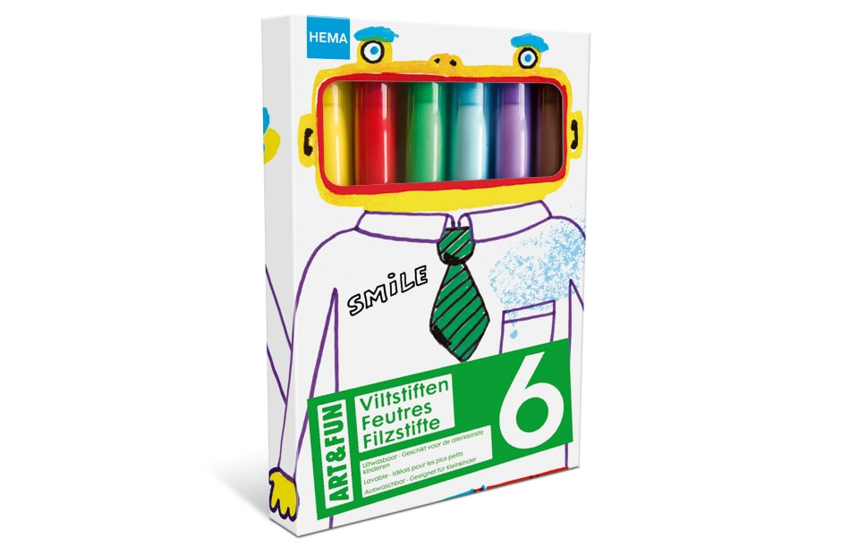
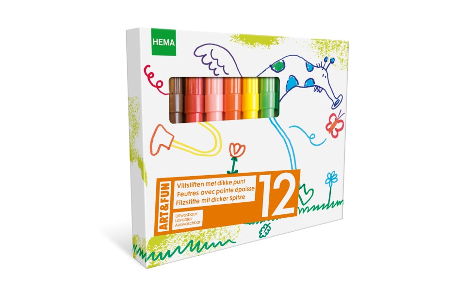
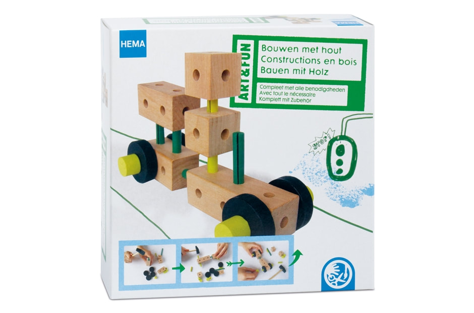
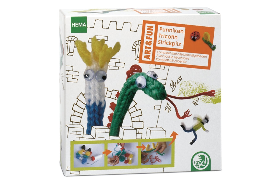
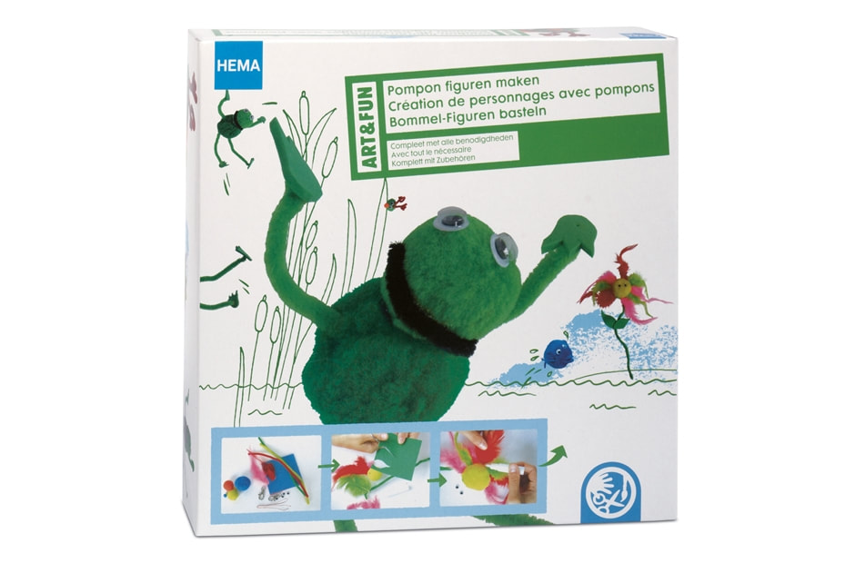
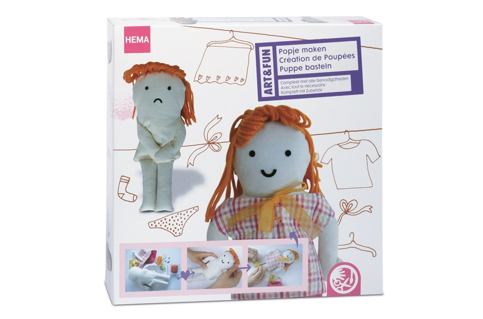
Voor deze HEMA Art & Fun verpakkingslijn was het niet toegestaan de bestaande stansvorm aan te passen. Er kwam een serie illustraties die daar rekening mee houdt: monsters, robots, fantasie-dieren, enz. De producten zelf spelen een belangrijke rol binnen de illustraties.
MARKERS AND CRAYONS For this HEMA Art&Fun packaging line it was not permitted to adapt the existing cutting die. Taking this into account a series of illustrations were created: monsters, robots, fantasy animals etc. The products themselves play an important role in the illustrations.
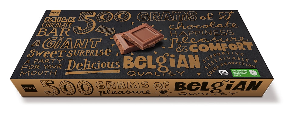
CHOCOLADEREEP 500 GRAM
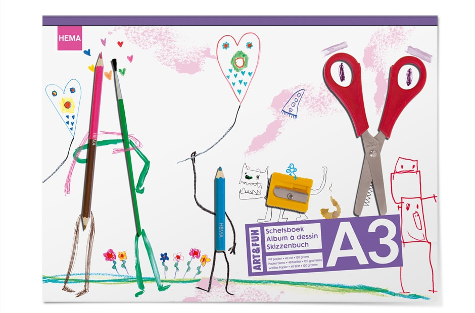
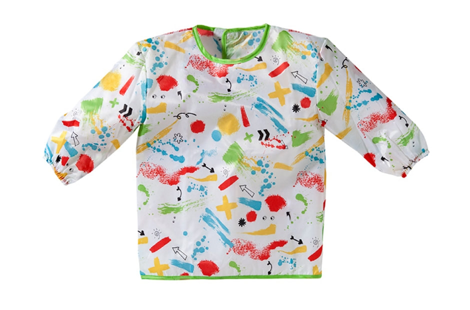
SCHETSBOEKEN EN KLIEDERSCHORT
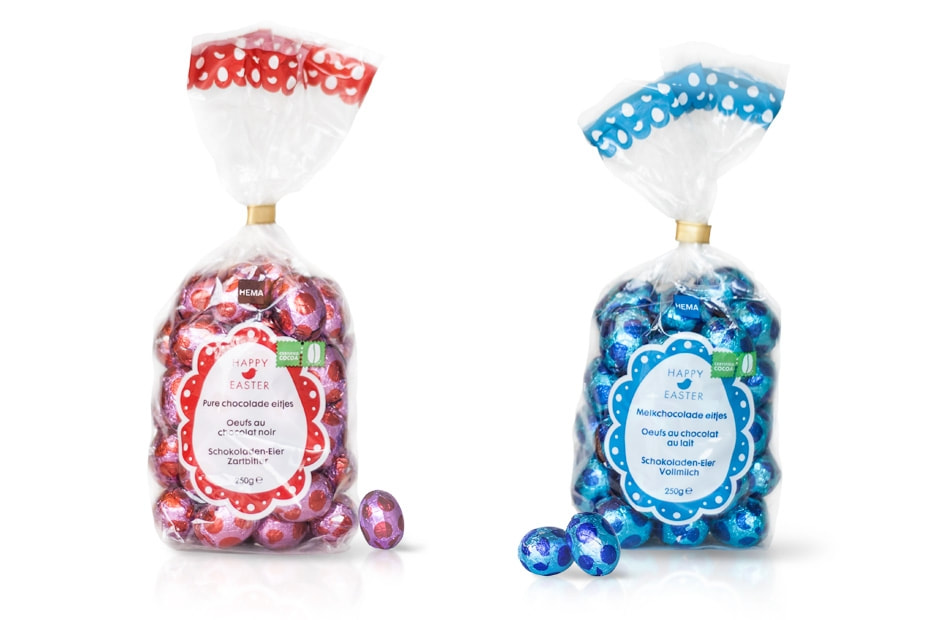
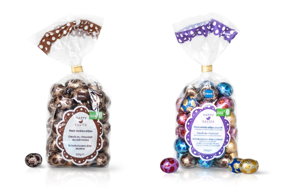
PASEN
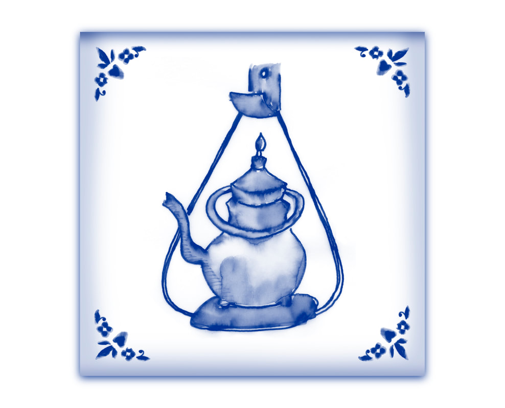
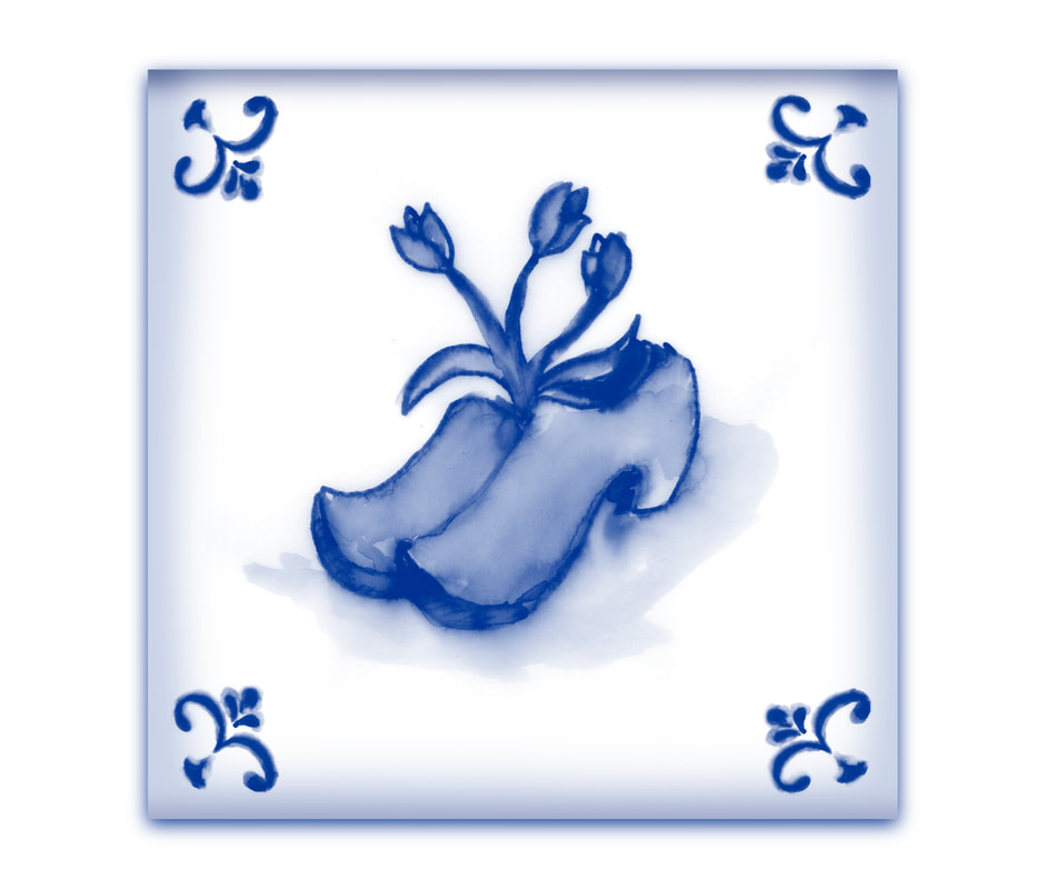
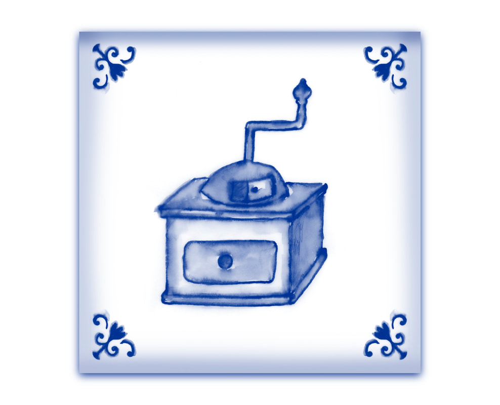
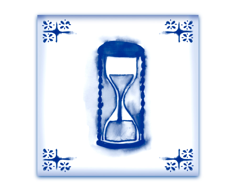
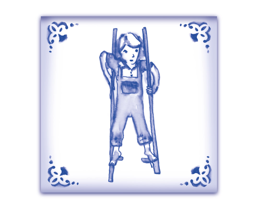
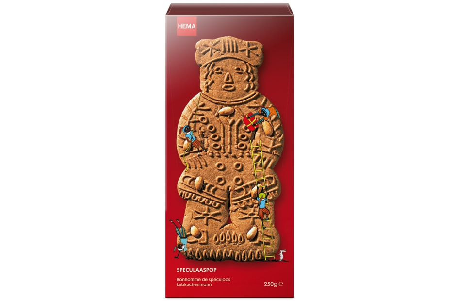
WINTER TEGELTJES
Deze tegeltjes met oudhollandse onderwerpen schilderde ik voor de wintercollectie van kruidnootjes, speculaaspoppen, banketstaven en ander snoepgoed. Als patroon werden ze gebruikt op deze producten.
WINTER TILES I painted these tiles with traditional Dutch subjects for the winter collection of spice nuts, gingerbread man, almond pastry and other sweets. They were used as patterns on these products.
WINTER TILES I painted these tiles with traditional Dutch subjects for the winter collection of spice nuts, gingerbread man, almond pastry and other sweets. They were used as patterns on these products.
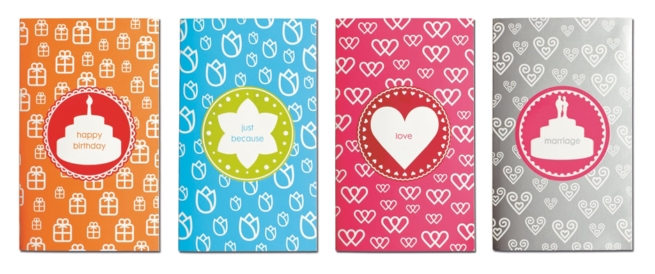
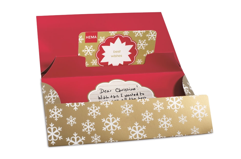
GIFTCARDS
HEMA gift cards verpakkingen mocht ik vormgeven voor verschillende gelegenheden zoals: verjaardagen, zomaar, liefde, trouwen en nog veel meer. De giftcard is een cadeau met verschillende thema's en er is ruimte om een persoonlijk bericht te schrijven.
I designed HEMA gift cards for various occasions such as birthdays, 'just like that', love, weddings and many more. The gift card is a present with a variety of themes and there is room to write a personal message.
I designed HEMA gift cards for various occasions such as birthdays, 'just like that', love, weddings and many more. The gift card is a present with a variety of themes and there is room to write a personal message.
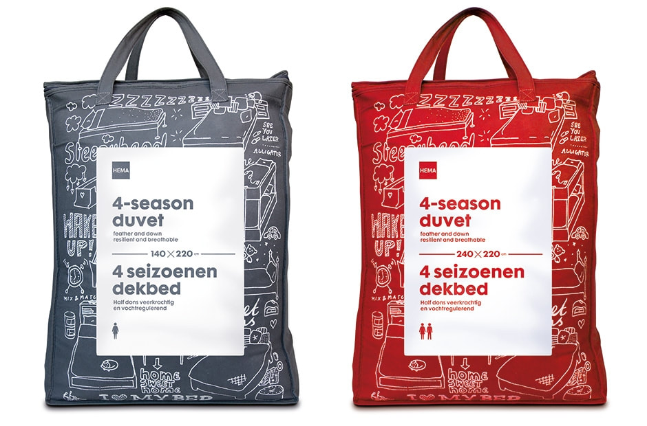
BEDDENGOEDVERPAKKING
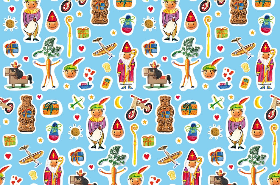
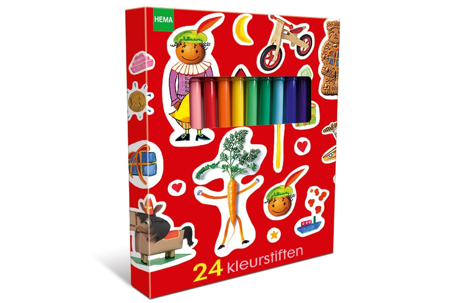
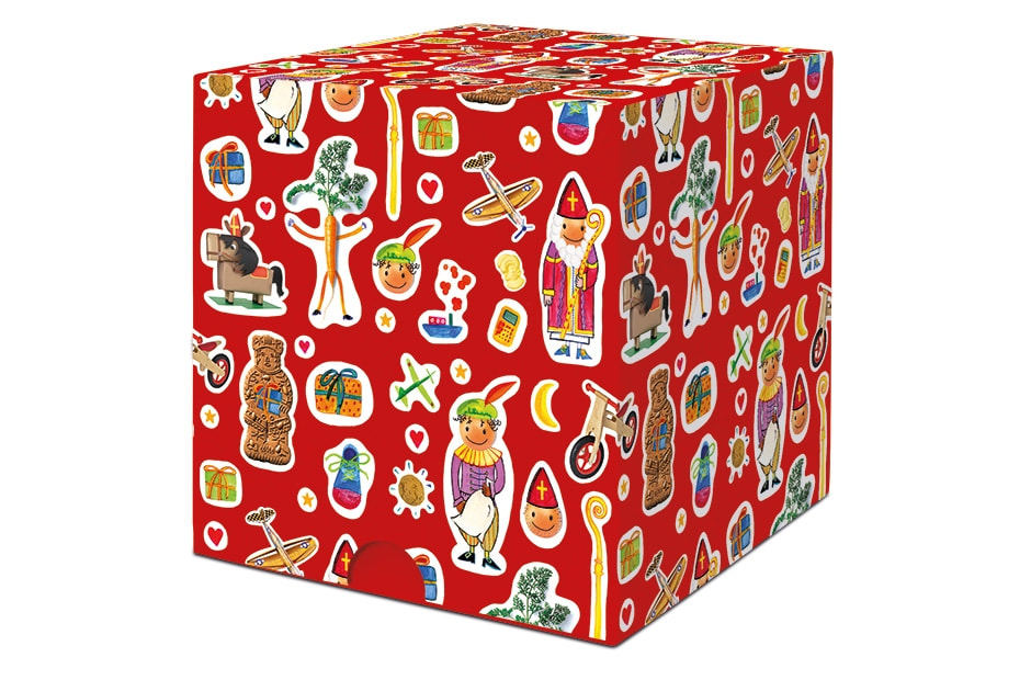
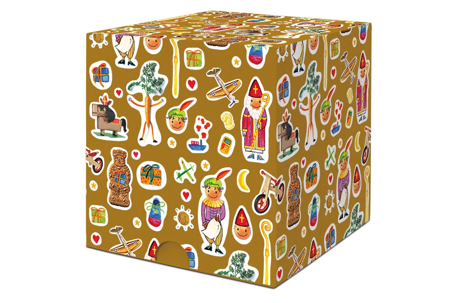
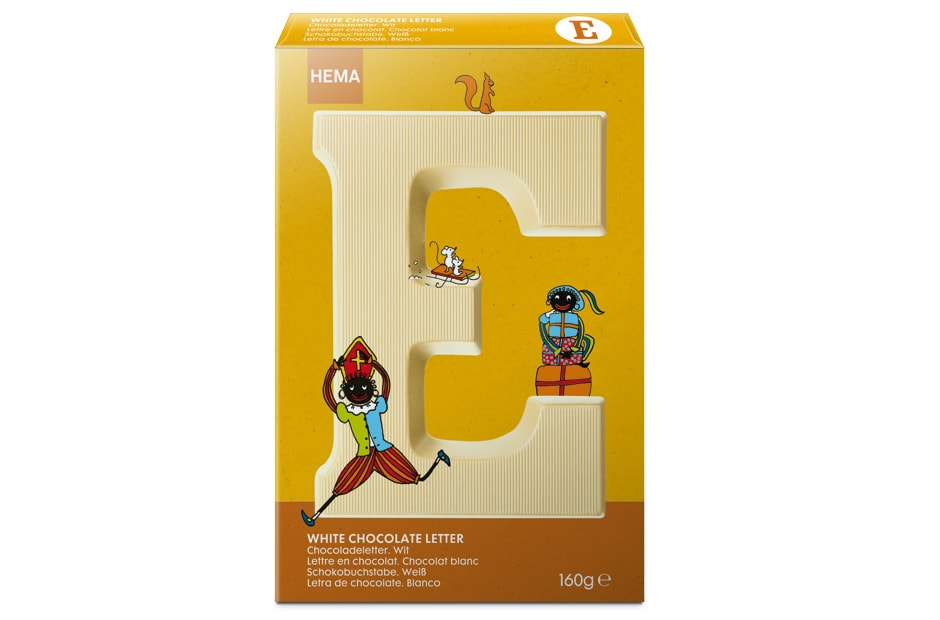
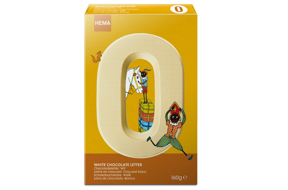
SINTERKLAAS
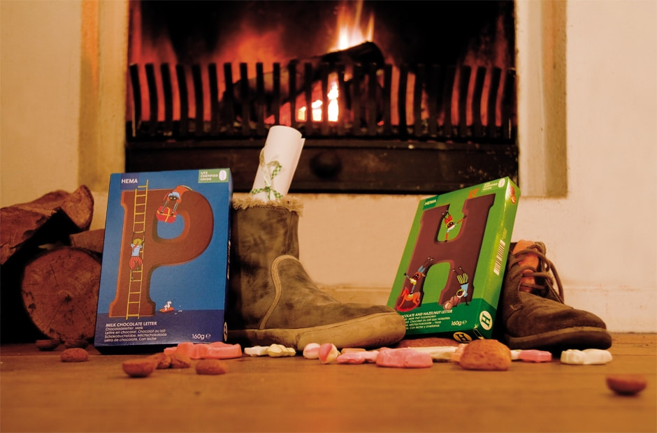
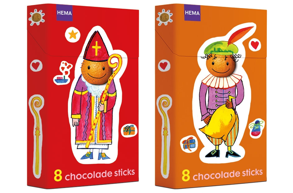
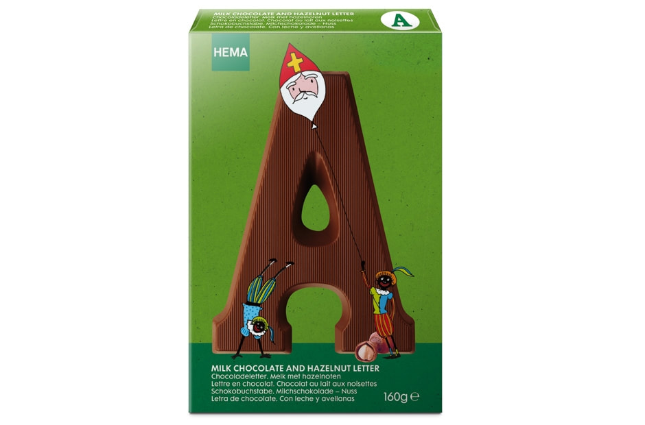
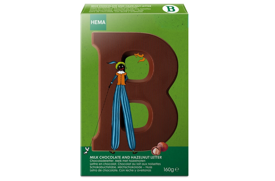
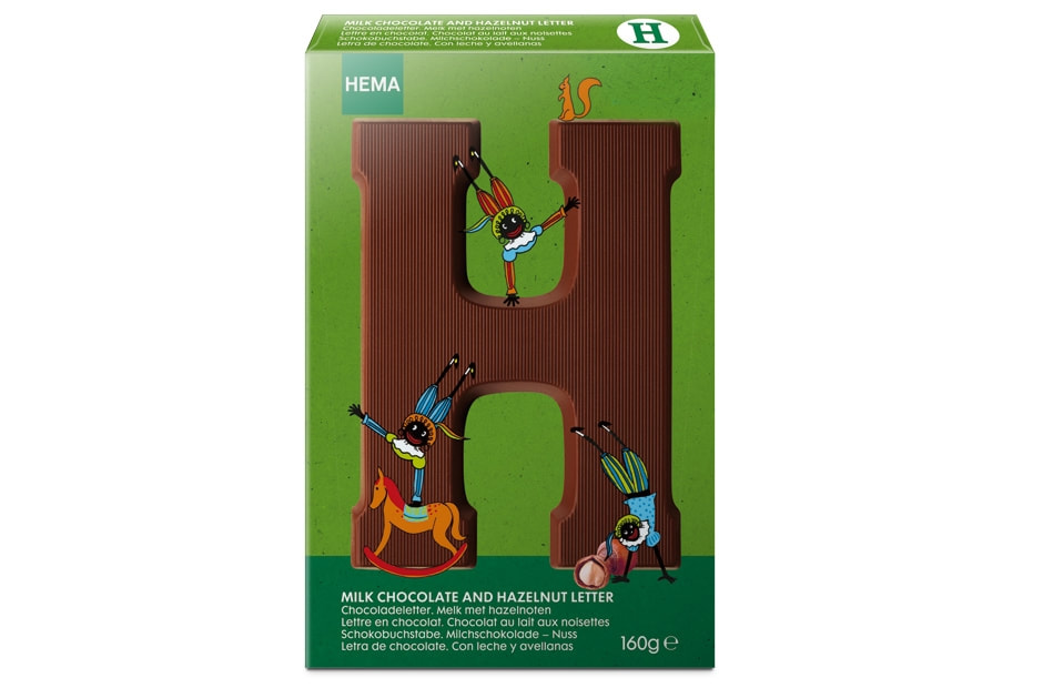
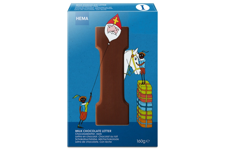
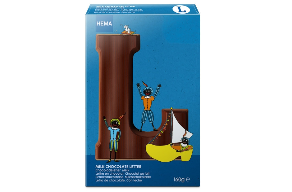
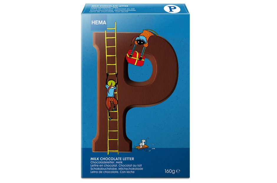
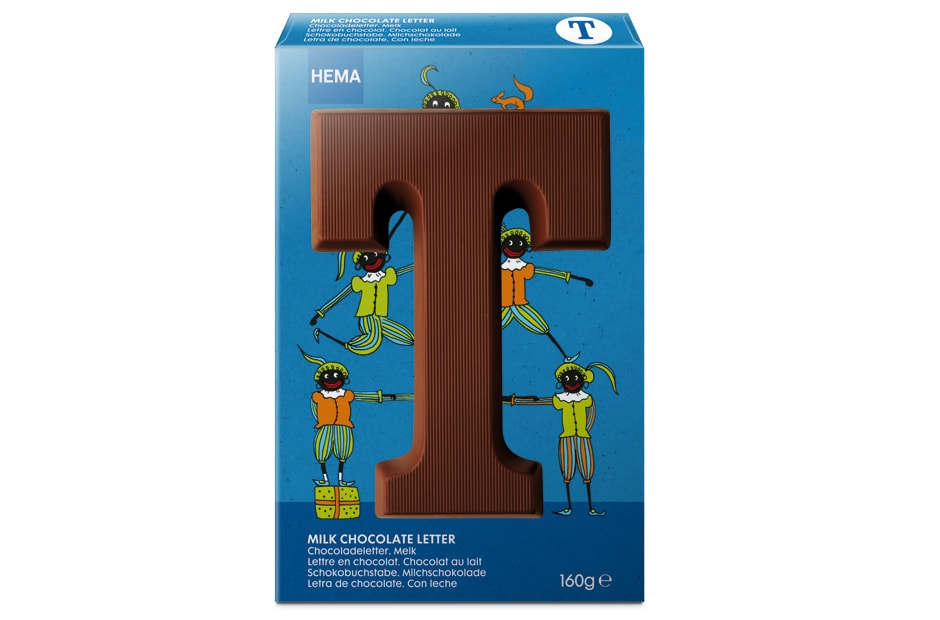
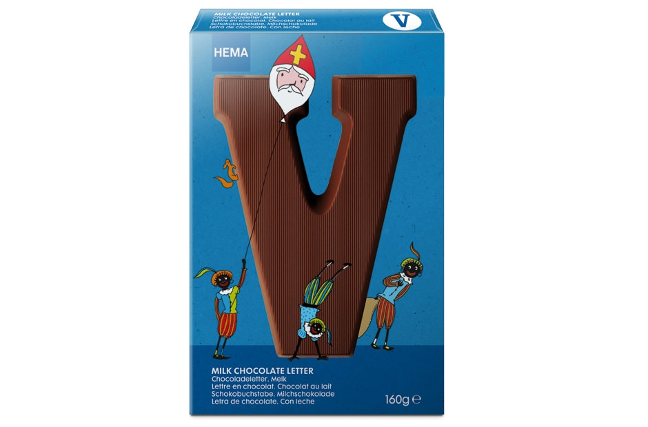
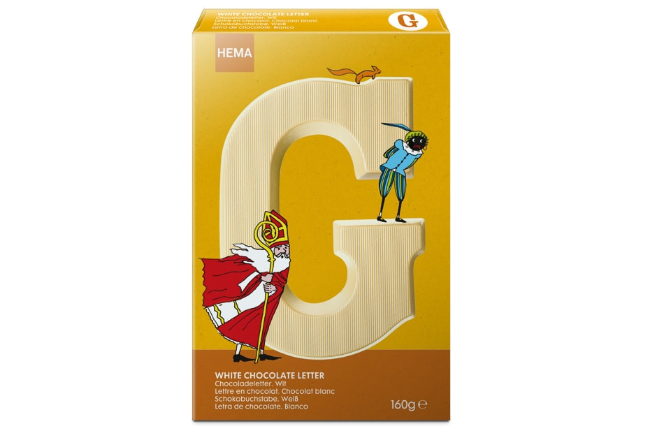
De verpakkingslijn, die ik hieronder eerst laat zien, illustreerde ik in 2013. In dit jaar hield de HEMA rekening met de zwarte-pieten-discussie. De hoofdjes van sint en piet zijn oranje sinaasappels. Bij de verpakkingslijn die ik eerder voor de HEMA illustreerde (letters waar pietjes op klimmen en stunts doen) hield de HEMA nog geen rekening met deze discussie. Het was toch erg leuk om aan allebei de verpakkingslijnen te werken. Een vrolijke uitstraling om alle kadootjes in te pakken!
The packaging line shown below was illustrated by me in 2013. In that year HEMA was conscious of the black-Pete discussion. The heads of Saint Nicholas and Pete are in the shape of oranges. In the previous packaging line that I illustrated for HEMA (letters on which Petes climb up and down and do stunts) the black-Pete discussion was not yet taken into account. It was fun to work on both lines and to create material that looks cheerful!
The packaging line shown below was illustrated by me in 2013. In that year HEMA was conscious of the black-Pete discussion. The heads of Saint Nicholas and Pete are in the shape of oranges. In the previous packaging line that I illustrated for HEMA (letters on which Petes climb up and down and do stunts) the black-Pete discussion was not yet taken into account. It was fun to work on both lines and to create material that looks cheerful!
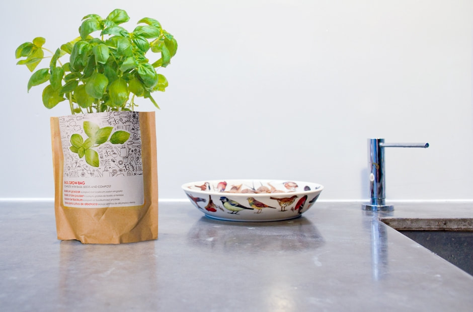
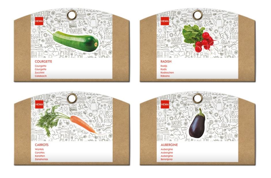
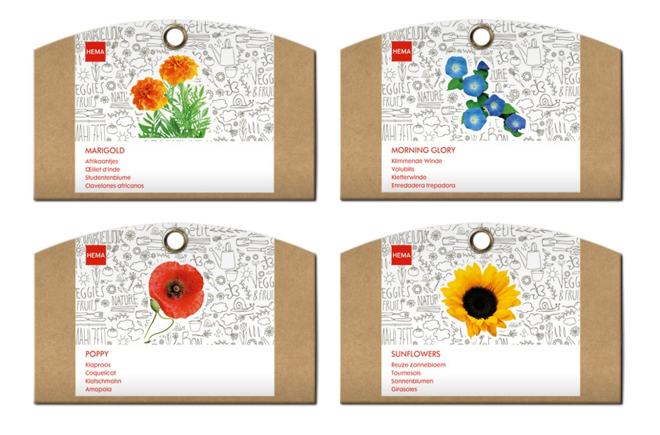
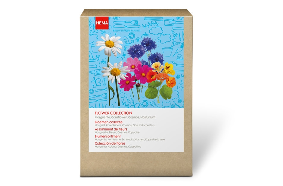
GROW IT YOUR OWN!
In deze verpakkingen kun je je eigen kruiden op het aanrechtblad kweken. Je koopt een zakje met daarin een mix van aarde en zaden, knipt de bovenkant ervan af en groeien maar! De verpakking moest natuurlijk wel leuk genoeg zijn om een tijdlang tegenaan te kijken. De rijk geïllustreerde verpakking benadrukt het persoonlijke en de lol van het zelf doen. De materiaalkeuze geeft de verpakkingen een natuurlijke en duurzame uitstraling.
Grow it your own! Buy your herbs in the supermarket, frozen or a ready-made plant? That's so old-fashioned! A conscious consumer grows its own herbs on the countertop. You buy a bag containing a mixture of soil and seeds, cut the top off and let it grow! The packaging material provides a natural and durable look. Indispensable for the conscious consumer!
Grow it your own! Buy your herbs in the supermarket, frozen or a ready-made plant? That's so old-fashioned! A conscious consumer grows its own herbs on the countertop. You buy a bag containing a mixture of soil and seeds, cut the top off and let it grow! The packaging material provides a natural and durable look. Indispensable for the conscious consumer!
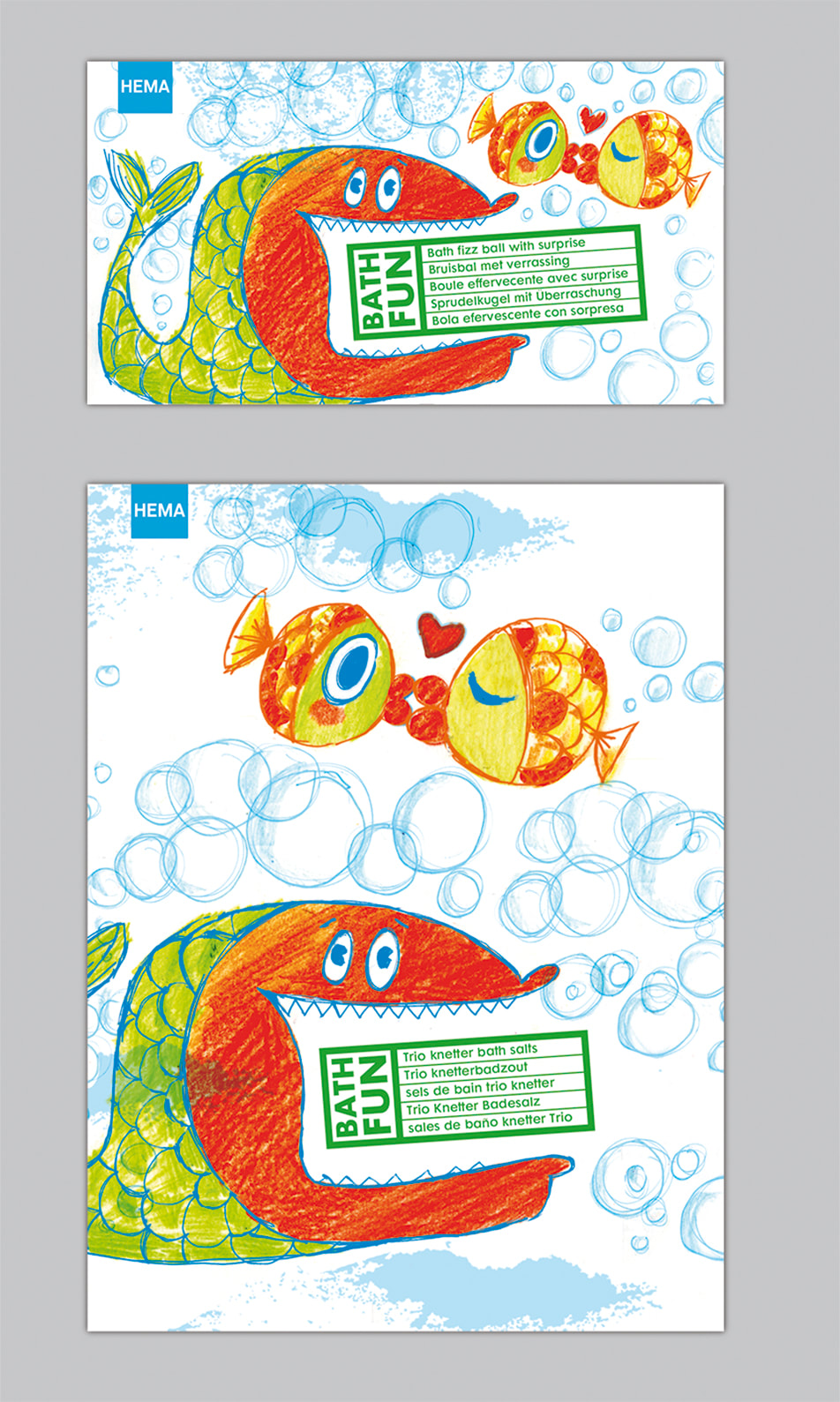
BADFUN
Dit zijn ontwerpen voor de voorzijde van badproducten, zoals een bruisbal en knetterzout.
VERPAKKINGEN ART & FUN
Merit winner European design awards 2008 en Nominatie ADCN prijs 2008
Merit winner European design awards 2008 en Nominatie ADCN prijs 2008
Op dit soort producten worden normaal gesproken foto’s afgebeeld die door de producenten zelf zijn gemaakt. De fotografie is in de meeste gevallen verre van creatief. Er was geen budget voor professionele fotografie, dus werd er gekozen voor fotografie in de studio met eigen digitale camera. De imperfectie die daardoor is ontstaan past goed bij deze creatieve producten! De combinatie van fotografie en handmatige illustraties prikkelt de fantasie.
Generally speaking photographs on this type of product are made by the producers themselves. In most cases the photographs are far from creative. There was no budget for professional photography and therefore photographs were made in our own studio with a digital camera. The resulting imperfection matches these creative products! The combination of photography and hand-made illustrations tickles the imagination.
Generally speaking photographs on this type of product are made by the producers themselves. In most cases the photographs are far from creative. There was no budget for professional photography and therefore photographs were made in our own studio with a digital camera. The resulting imperfection matches these creative products! The combination of photography and hand-made illustrations tickles the imagination.
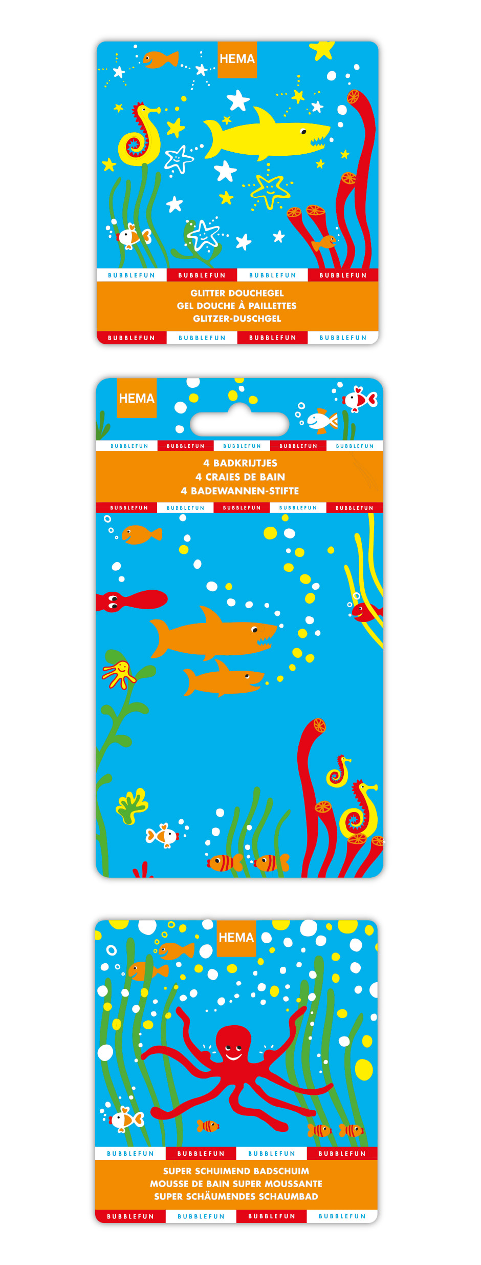
BUBBELFUN
Deze productlijn met glitter douchegel, badkrijtjes, super schuimend badschuim is voor kinderen een extra stimulans om in bad te willen.
This production line with sparkling shower gel, bath crayons, super frothy bath foam is an extra stimulus for children to want to take a bath.
This production line with sparkling shower gel, bath crayons, super frothy bath foam is an extra stimulus for children to want to take a bath.
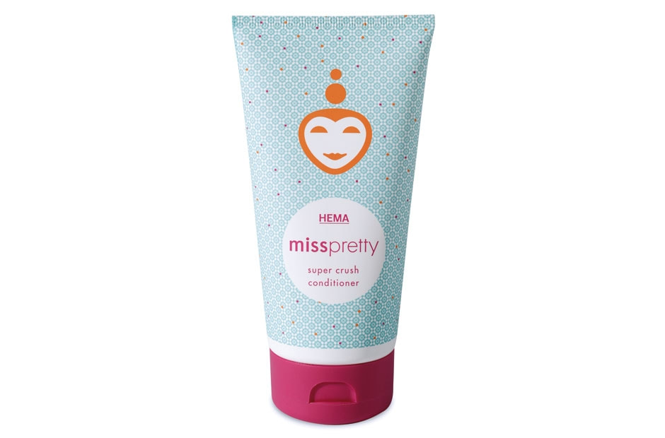
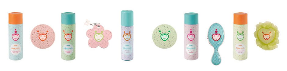
MISS PRETTY
Miss Pretty een verzorgingslijn speciaal bestemd voor meiden in de leeftijd van 7 tot 10 jaar. De characters zijn gebaseerd op Japanse vormgeving en verrassend gecombineerd met een kleurrijk patroon.
Miss Pretty is a line of personal care products especially aimed at girls at the age of 7 to 10. The characters are based on Japanese design and are strikingly combined with a colourful pattern.
Miss Pretty is a line of personal care products especially aimed at girls at the age of 7 to 10. The characters are based on Japanese design and are strikingly combined with a colourful pattern.
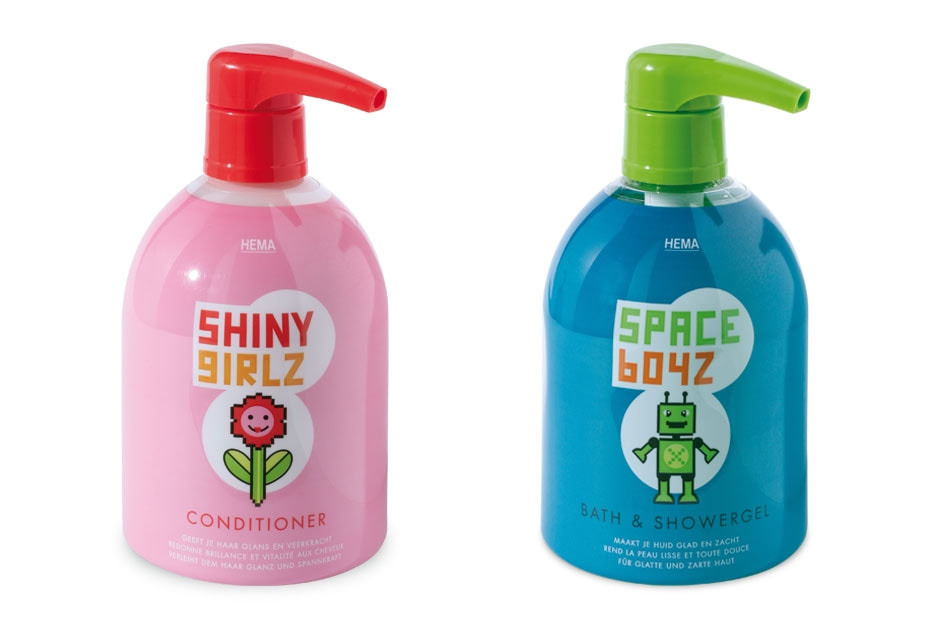
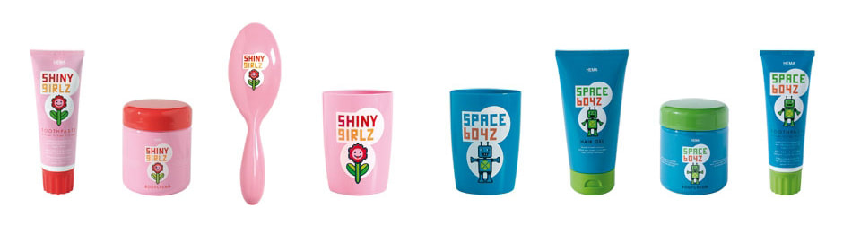
SHINY GIRLZ & SPACE BOYZ
De verzorgingsproducten in de verpakkingslijnen ‘Shiny Girlz’ en ‘Space Boyz’ zijn bestemd voor kinderen van 3 tot 6 jaar. De frisse vormgeving maakt gebruik van pixelart en zelf tekende ik de letters.
The personal care products in packaging lines 'Shiny Girlz' and 'Space Boyz' are aimed at children between 3 and 6. The fresh design uses pixel art and I was responsible for the lettering.
The personal care products in packaging lines 'Shiny Girlz' and 'Space Boyz' are aimed at children between 3 and 6. The fresh design uses pixel art and I was responsible for the lettering.
BABY & MAMA VERPAKKINGSLIJN
Winnaar ADCN prize 2003 en Nomination Dutch design awards 2004
Winnaar ADCN prize 2003 en Nomination Dutch design awards 2004
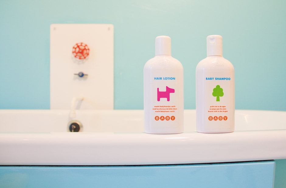
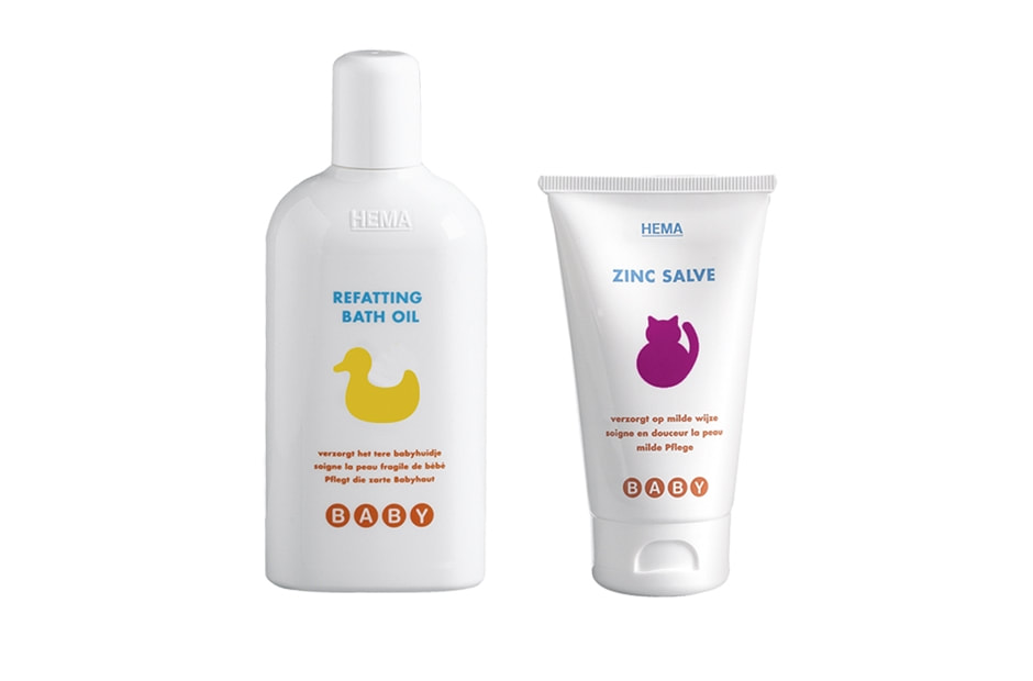
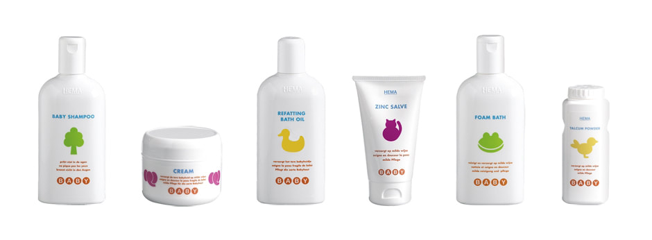
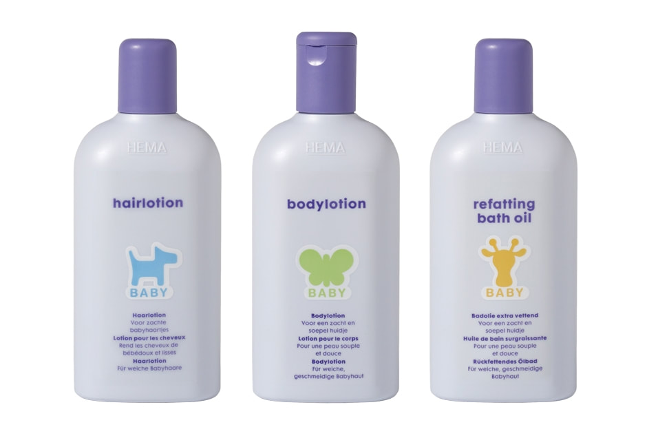
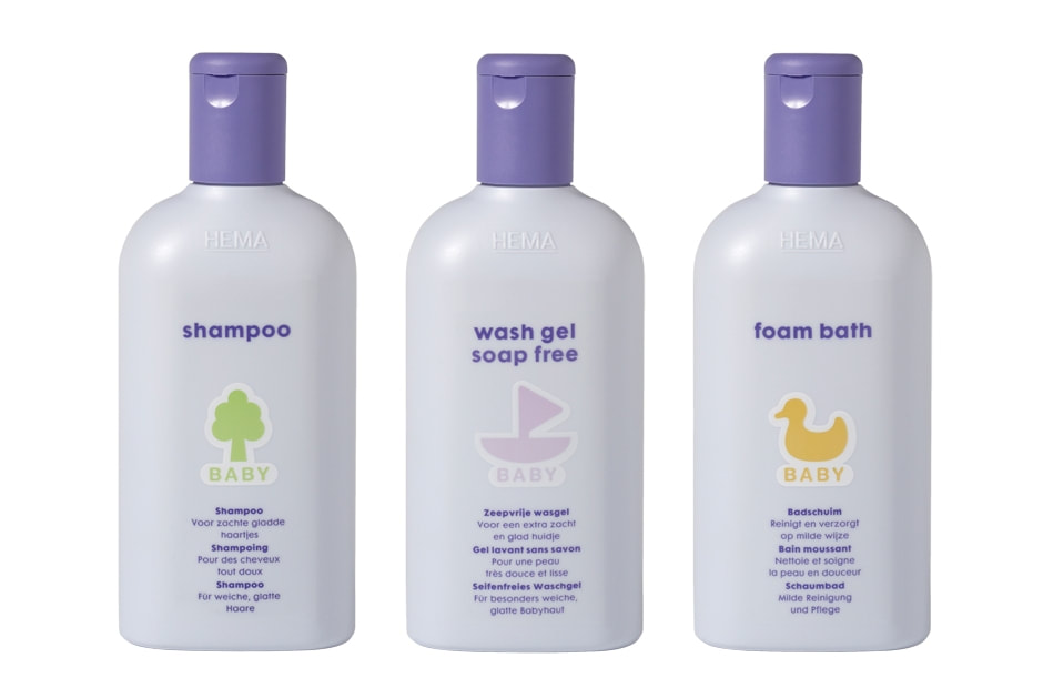
Deze verpakkingslijn bestond uit ongeveer 40 producten. Voor de verschillende verpakkingen ontwikkelde ik in dienst van Studio Kluif een pictogram als een soort ‘leesplankje’. De witte basiskleur past in elke babykamer. Soms zijn ontwerpen tijdloos, dat vind ik van deze verpakking ook. Vijf jaar later wilde de HEMA het wit vervangen door pasteltinten. Het aangepaste ontwerp werd zachter van uitstraling, het glanzende wit werd vervangen door een mat fluweelachtig violet. Het oorspronkelijke concept blijft overeind: de ikonen op de producten (eend, boot, hond, giraf, etc.) zijn herkenbare afbeeldingen die peuters kunnen helpen met het leren van nieuwe woordjes.
This packaging line consisted of some 40 products. As an employee of Kluif I designed a pictogram as a kind of 'reading board'. The basic white colour is suitable for any baby room. Sometimes designs are ageless and that is what I think of this packaging. Five years later HEMA wanted to replace the white by pastels. The design was adapted to make it softer in outlook, the shining white was replaced by a matt velvety violet. The original concept was retained, the icons on the products (duck, boat, dog, giraffe, etc.) are recognisable images that can help youngsters to learn new words.
This packaging line consisted of some 40 products. As an employee of Kluif I designed a pictogram as a kind of 'reading board'. The basic white colour is suitable for any baby room. Sometimes designs are ageless and that is what I think of this packaging. Five years later HEMA wanted to replace the white by pastels. The design was adapted to make it softer in outlook, the shining white was replaced by a matt velvety violet. The original concept was retained, the icons on the products (duck, boat, dog, giraffe, etc.) are recognisable images that can help youngsters to learn new words.